

Colors have the power to make or break the design aesthetics of a space. In fact, they are what give it its character. Ranging from vibrant to neutral to muted, there is a plethora of shades and combinations you can choose from for your interiors. As it can be a very confusing and tedious process, here’s a little help from us: color combos that can almost, never go wrong.
Pastels + Grey
The combination of the soft shades of grey and pastels is not just a feast for the eyes, but it’s also a soothing remedy for the body and mind. For this ice cream parlor, Studio Gritt combined pastel pink and green with light grey to create a space that’s as mellow and soft as the products they sell.
 Studio Gritt
 Studio Gritt
Charcoal + Yellow
A win-win combination that produces great results. These two shades complement each other perfectly – while charcoal helps to mellow down the bright hues of yellow, yellow gives life to the classic dark grey.
 Studio Gritt HQ in Bengaluru
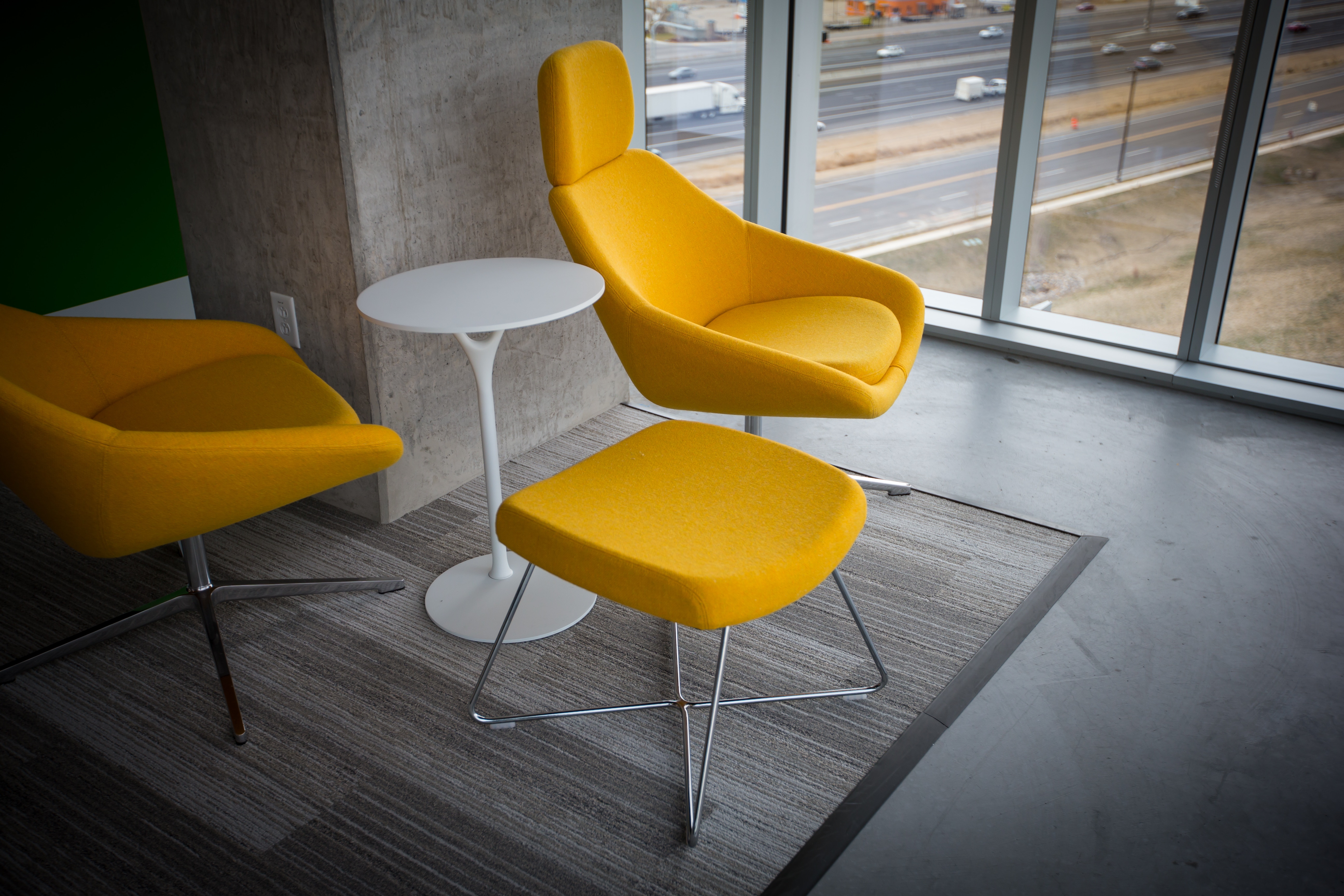 Photo by Benjamin Child on Unsplash
Blush + Cream
You’ll absolutely fall in love with this pretty combination of two soft and subtle colors, the baby blush pink and the delicate cream/beige. And it’ll probably never go out of vogue either.
 Photo by Grovemade on Unsplash
 Photo by Liana Mikah on Unsplash
Brown + Beige/Tan
The combination of the darker and lighter shades of brown is a classic favorite. It gives an all-natural and pure look to the interiors.
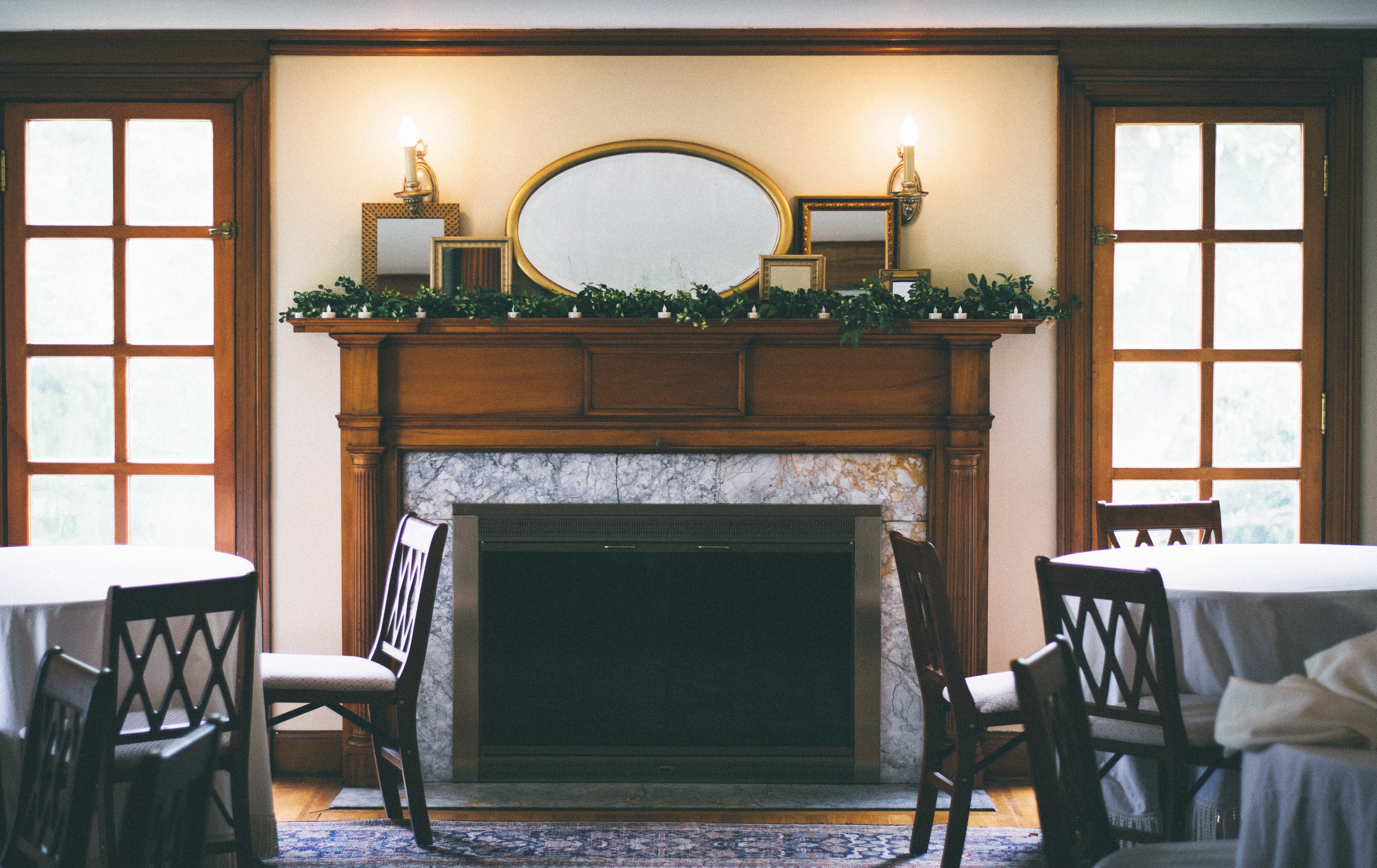 Photo by Nathan Fertig on Unsplash
 Photo by Tomoko Deguchi on Unsplash